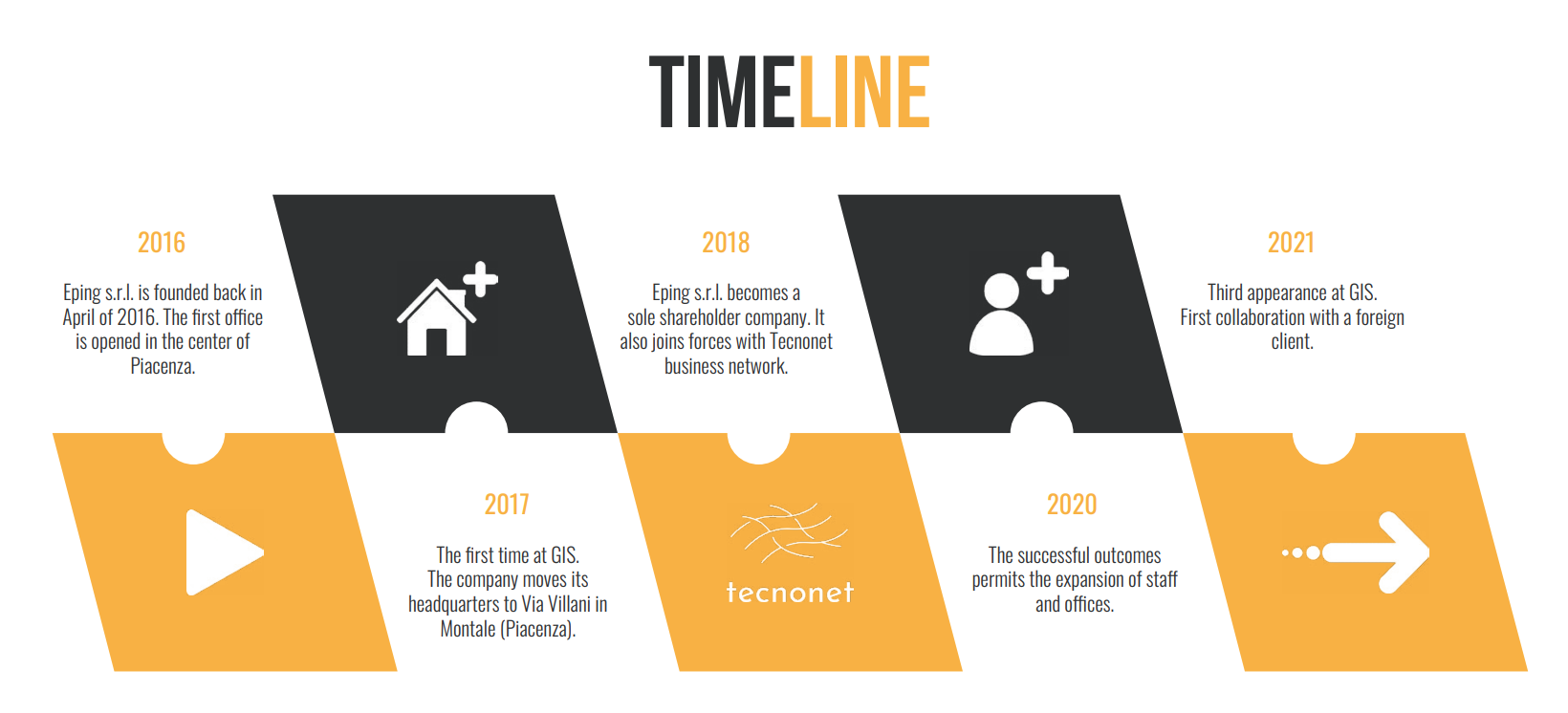
Since its founding, Eping has experienced exponential growth.

With passion and determination, Eping has continued to progress and evolve year after year… in fact, month after month! The staff has grown, along with the challenges and the desire to overcome them, creating a strong and united team characterized by the desire to improve and learn, always supporting and helping each other day by day. Eping moves forward, changes, evolves, and grows.
It is with this spirit that we decided to find a way to communicate to the outside world what is happening here within the walls of our studio. And so, we came up with the idea… why not change the logo, which is the first thing people see and recognize about us?
And here it is, our new logo!

The restyling is very subtle in appearance but, in our opinion, extremely effective: first and foremost, the font has changed. It has become solid and robust, much like the discipline of engineering itself. The “ING” has given a strong stroke to the line above it, which, in some ways, enclosed and framed it, and the line below it has thickened, as if to emphasize it. But Eping is much more: it is one with design. This strong synergy that characterizes the studio is accentuated by coloring the “&“.
We couldn’t wait any longer, we were bursting to share some of what we have in mind with you in some way.
We are working on the new website to be able to communicate to those who do not know us what we are, and to those who already knew us, how much we are changing. We are paying close attention to the smallest details, and for this, we ask for a little more patience.


